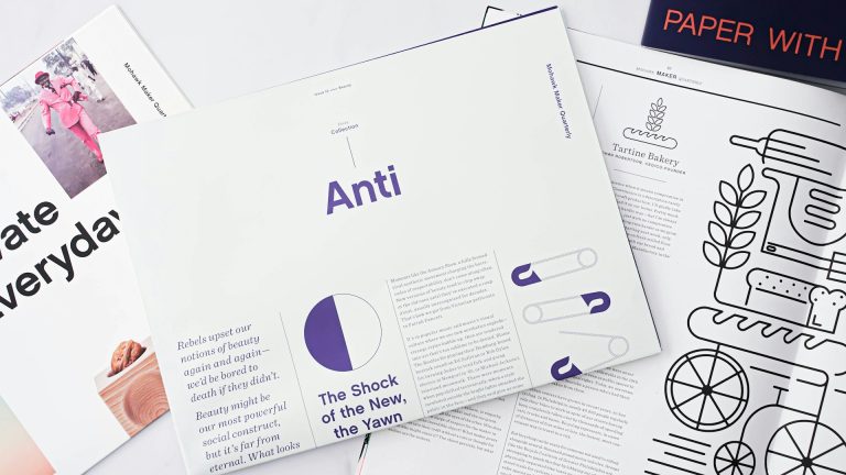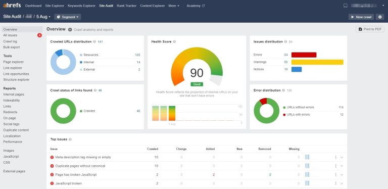

What is an Infographic?
An infographic is a chart that simplifies complex information. It can be a series of images or tables, intended to help readers quickly receive a large amount of information with visual aids. In recent years, it has been commonly used in presentations, meetings, articles, and more.
Businesses might use infographics to explain product performance, or they can be used for course materials or poster creation.
It can both enhance reader comprehension and helpincrease content shareability.。
The Importance of Infographics for Articles
Taking “Periodontal Disease Prevention and Improvement” as the theme, the report on the left explains why periodontal disease occurs, its consequences, how to prevent it, and so on. It has all the structure an article should have! But what is it lacking?
The image on the right summarizes the conclusions into 3 steps, usingvisual memoryto condense the answer into one image. A five-minute report can be simplified to be understood in 30 seconds, making it easy to read during commutes, short lunch breaks, and other brief moments!
Isn’t this convenient for modern people who are pressed for time?


What qualities should a good infographic possess?
- Beautiful Images: Use color schemes, layouts, or simple illustrations to make content more appealing.
- Structured Content: Arrange content in a logical order to make it easier for readers to understand.
- Reliable Data: To ensure accuracy, data sources must be correct; otherwise, you’re conveying misinformation!
You can also create graphics based on your website’s color scheme for better overall consistency!
Now that you understand the three key points, let’s look at how to create eye-catching infographics!
1. Clear Theme
An infographic isn’t just about having pictures. First, we need to determine the theme, so readers can immediately understandwhat the main point is, because that’s what they want to know most!

The image above integrates product introductions into an infographic, capturing readers’ attention and informing them about basic feline stress behaviors. Readers with cats at home will immediately think of this product as a way to soothe their pets, greatly enhancing the product’s advertising effect.
2. Logical Guidance
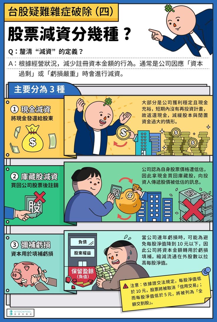
After organizing the information, remember the“Golden Three-Point Principle”: three main points, here divided into three steps, to help readersprogressivelyunderstand the answer to a question.
Although there are more than three types of “stock capital reduction,” after reviewing these three major categories, readers will begin to form an answer to their question. They will then proceed to the website to find the information they truly need, and further, they will find the right person for consultation.
Assisted by exquisite illustrations and using a linear layout, the visual flow is from top to bottom, which perfectly matches the reading order on websites and mobile phones.
3. Visual Design
Infographics often attract people with their visual design. Even without a design background, you can utilizecolor schemes and repeated iconsTo achieve thematic consistency, simple materials can avoid over-decoration that might hinder understanding.


The image on the left uses “greenhouse gases” as its theme, supplemented by hot air balloons and data, and then selectsan easy-to-read font. Difficult and complex information suddenly becomes easy to understand. Compared to a report filled with 5 pages of data, a clear and concise image makes people more willing to continue reading.
In terms of layout, usingrepeated hot air balloon elementshas the effect of continuously emphasizing “greenhouse gases.”
The image on the right, on the other hand, expresses the number of park visitors using a horizontal bar chart. By looking at the length of the lines, you can tell which months are off-peak or peak seasons. This is also very suitable for creating presentations and proposals.
As for image color schemes, as long as you masterthe “631 rule”and identify the main color, auxiliary color, and accent color, your images can also become attractive and high-quality!
Not a designer? You need these tools!
Looking at a series of beautifully crafted images, do you feel there’s a chasm to cross?
How can someone with no background in drawing or design layout create infographics?
Here are some handy tools I recommend to everyone!
Practical Tool 1: CANVA
I believe everyone is familiar with CANVA. It has been a presentation savior for office workers, students, and teachers in recent years. In addition to various presentation templates, you can now create infographics instantly!
How to create infographics using CANVA? It’s completely free!
Practical Tool 2: Nakpin AI
Nakpin AI is a recently launched chart generation tool. Compared to CANVA, it doesn’t have as many templates to choose from, but it can directly generate charts based on your text and data. Just organize your data, copy and paste it in,in just 30 seconds, a chart ready for meetings and reports is complete!

Napkin AI Tutorial – Boost Your Articles, Presentations, and Proposals!
Many people struggle with how to create good accompanying images for their articles. Infographics are actually very suitable. Using interesting visual images with your article not only makes it look more professional but also helps readers quickly grasp the key points. This visual approach is particularly effective for long articles.
Even if you’re not from a design-related major, with the help of tools, you can create clear and organized information visualization charts! Give it a try!
Frequently Asked Questions
What is an Infographic?
An infographic is a visual representation that simplifies complex information, using images, charts, or illustrations to help readers quickly grasp large amounts of data. It is commonly used in presentations, meetings, articles, product explanations, and marketing materials.
How do infographics help articles?
Infographics can condense lengthy text into simple steps or key points, helping readers understand content in a short amount of time. They enhance an article’s readability and attractiveness, and increase shareability, making them particularly suitable for modern fast-paced reading habits.
What are the characteristics of a high-quality infographic?
A good infographic should include: 1. Exquisite images and design to attract readers’ attention; 2. Structured content to present information clearly; 3. Reliable data sources to avoid misleading readers; 4. Consistent color scheme and brand style to enhance professionalism.
What are the key points for creating an infographic?
Three key points: 1. Clear theme, allowing readers to grasp the core message at a glance; 2. Logical guidance, such as presenting information in three steps; 3. Visual design, using layout, color schemes (631 rule), and repeating elements to emphasize the theme.
What tools can help quickly create infographics?
Common tools include: 1. CANVA – offers a variety of free templates, suitable for presentations and chart creation; 2. Napkin AI – can quickly generate charts based on text and data, suitable for situations requiring quick output. Even without a design background, you can create professional infographics.